Cliente: SEISCO

Industria: Energía y Optimización.

Ubicación:  Ciudad de México, CDMX.

6co necesitaba una imagen seria que representara los valores principales de la empresa eligiendo con un color característico que la separe de sus demás competidores, la mayoría utilizando una imagen en colores verde y remitiendo a lo “ecológico”. 

En el momento de desarrollar el proyecto se utilizó las siglas de la empresa Smart Energy Integrated Solutions (SEIS) como base para generar el logo de manera numérica, la paleta de colores es sobria utilizando un gris como base con contrastes en naranja brillante esta combinación de colores refleja un balance perfecto entre el estilo serio y tecnológico de la empresa, separandola de sus competidores.

KEYWORDS: Branding, logotipo, papelería, presentaciones, diseño digital.

Client: SEISCO

Industry: Energy & Optimization

Location: Mexico City

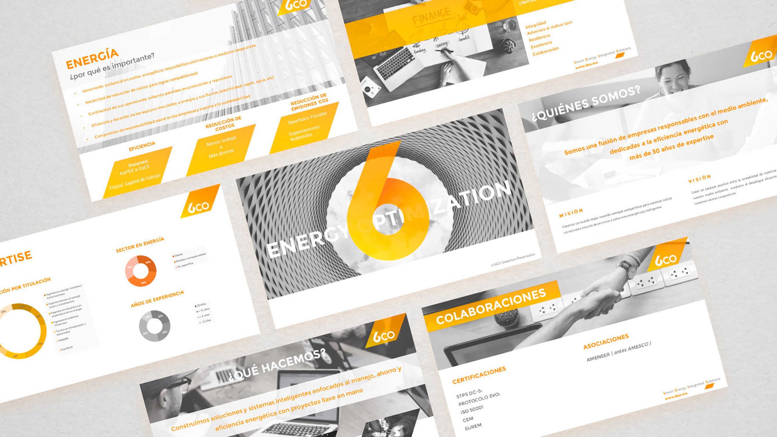
6CO was in need for a serious image that represented the main values ​​of the company. By choosing a characteristic color that separated them from its competitors, most of them making reference to the ecological brand in green colors.
 
At the time of developing the project, the acronym of the company Smart Energy Integrated Solutions (“seis”, six in Spanish) was used to create the logo in a numerical way, the color palette is sober using shades of gray as a base with high contrasts in bright orange. This color combination reflects a perfect balance between the technological style and seriousness of the company, standing out from their competitors.