Cliente: PŌSTERR

Industria: Diseño y Arquitectura

Ubicación:  Ciudad de México, CDMX.

La primer impresión es la más importante. Define el rumbo de una interacción de manera decisiva, es nuestra carta de presentación ofreciendo no sólo un servicio de calidad sino teniendo una imagen profesional, actual y funcional.

El principal objetivo al diseñar nuestras tarjetas fue destacar, reflejando la pasión por los detalles en el diseño que nos representan. Se trabajó todo en un formato y una retícula basados en la proporción áurea y conjugamos nuestro emblemático color rojo con el blanco logrando cautivar la mirada, para luego enamorar al tacto con la diversidad de texturas de la impresión y los dos tipos de papel empalmados.

Keywords: Papelería, Tarjeta de presentación, Impresión, Branding.

Client: PŌSTERR

Industry: BRANDING & ARCHITECTURE

Location: Mexico City

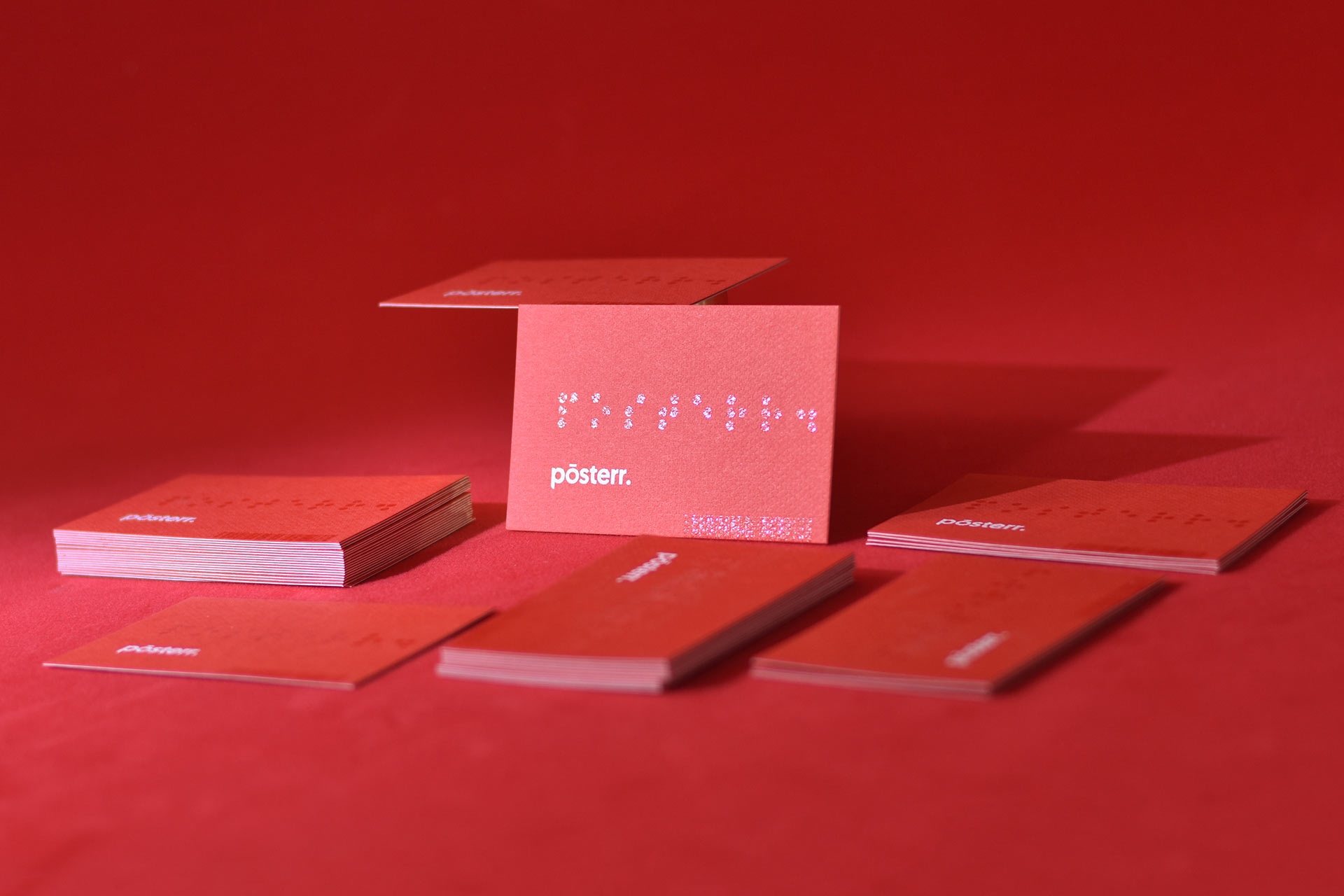
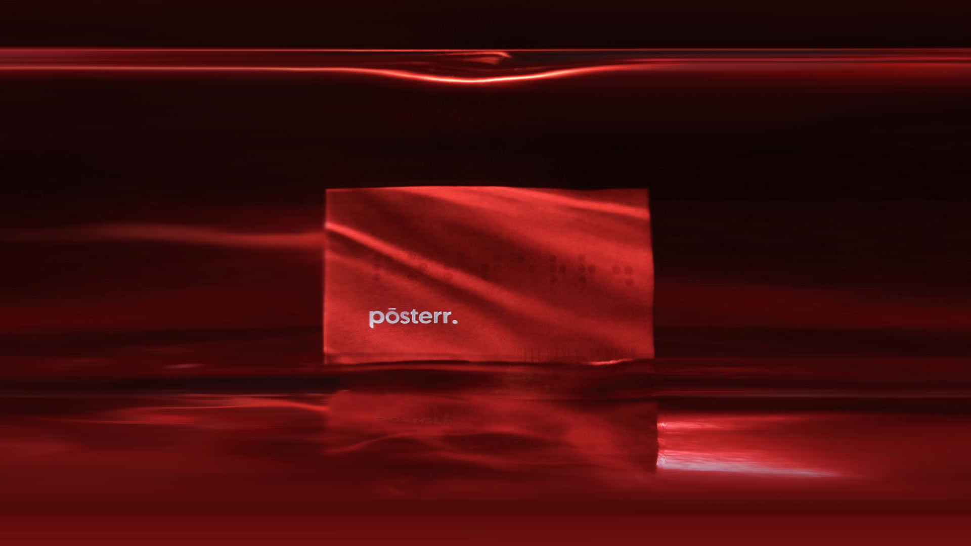
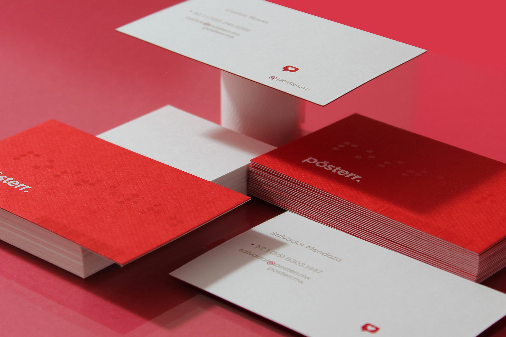
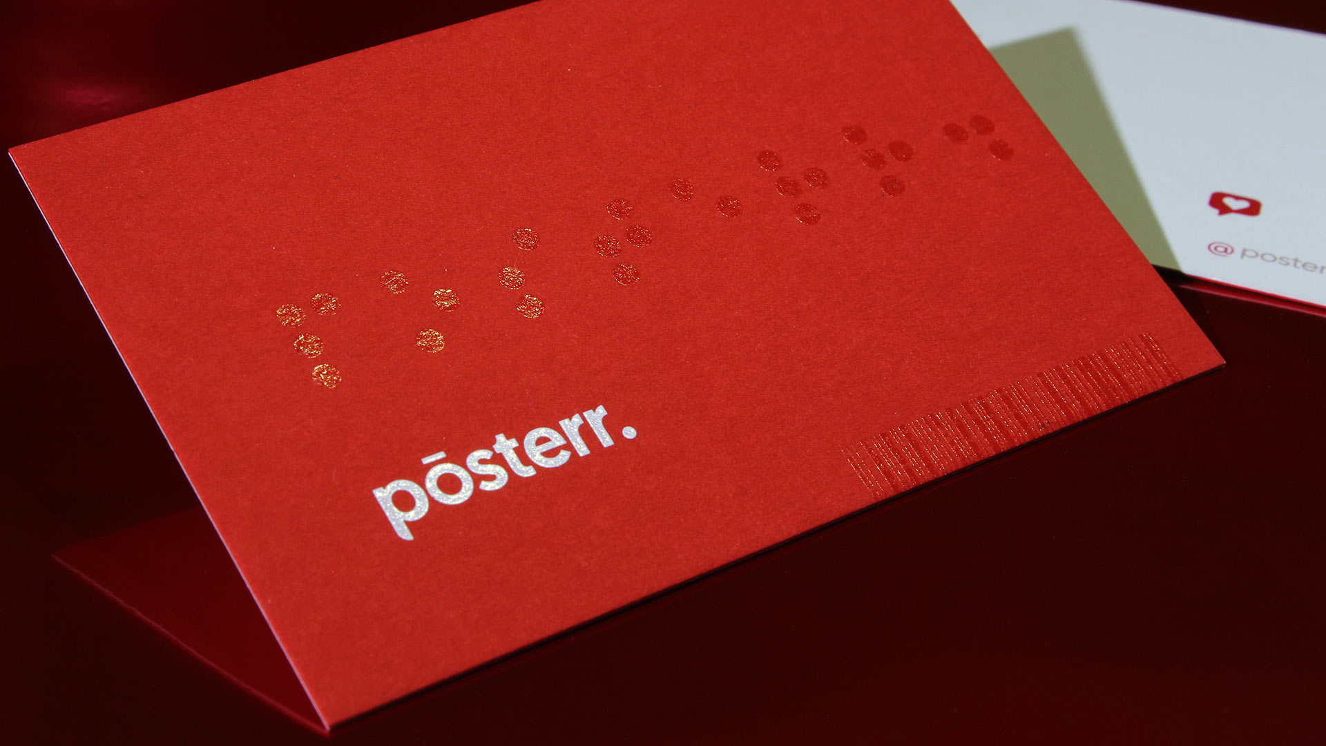
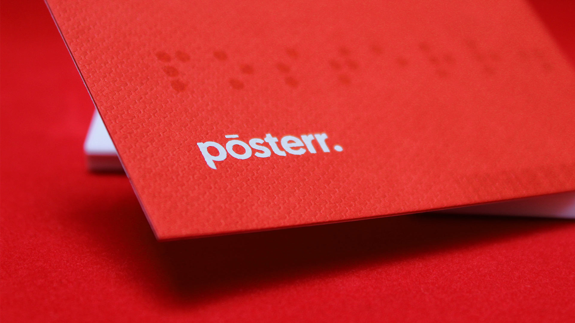
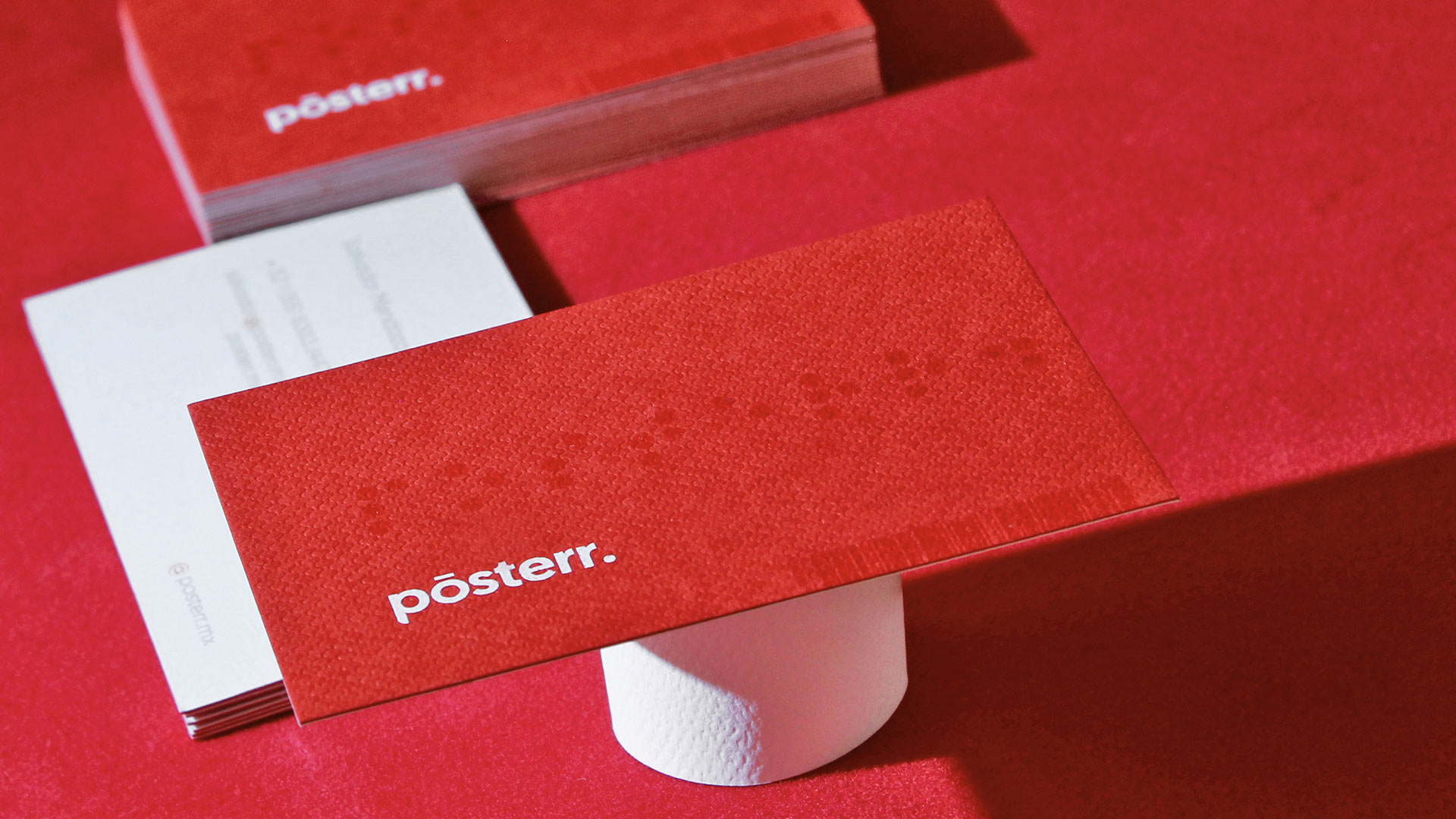
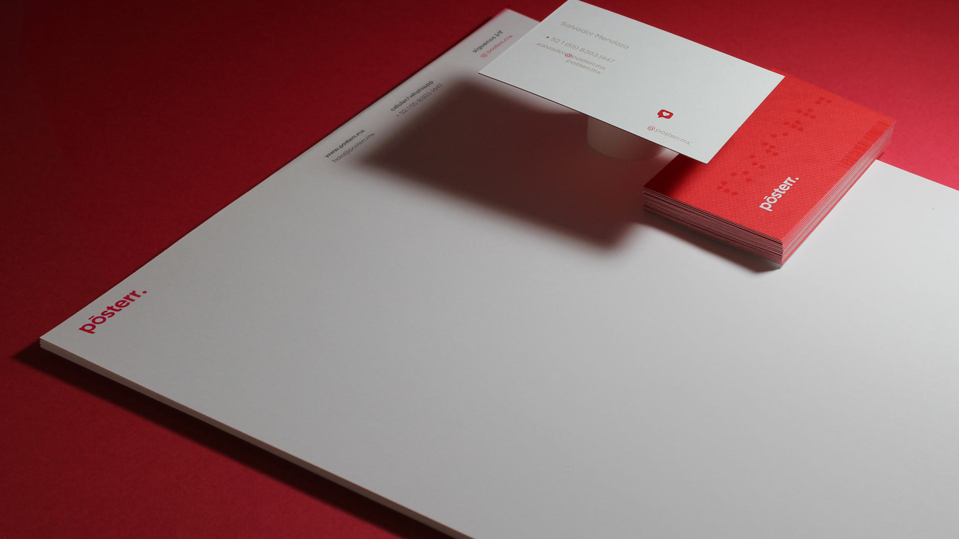
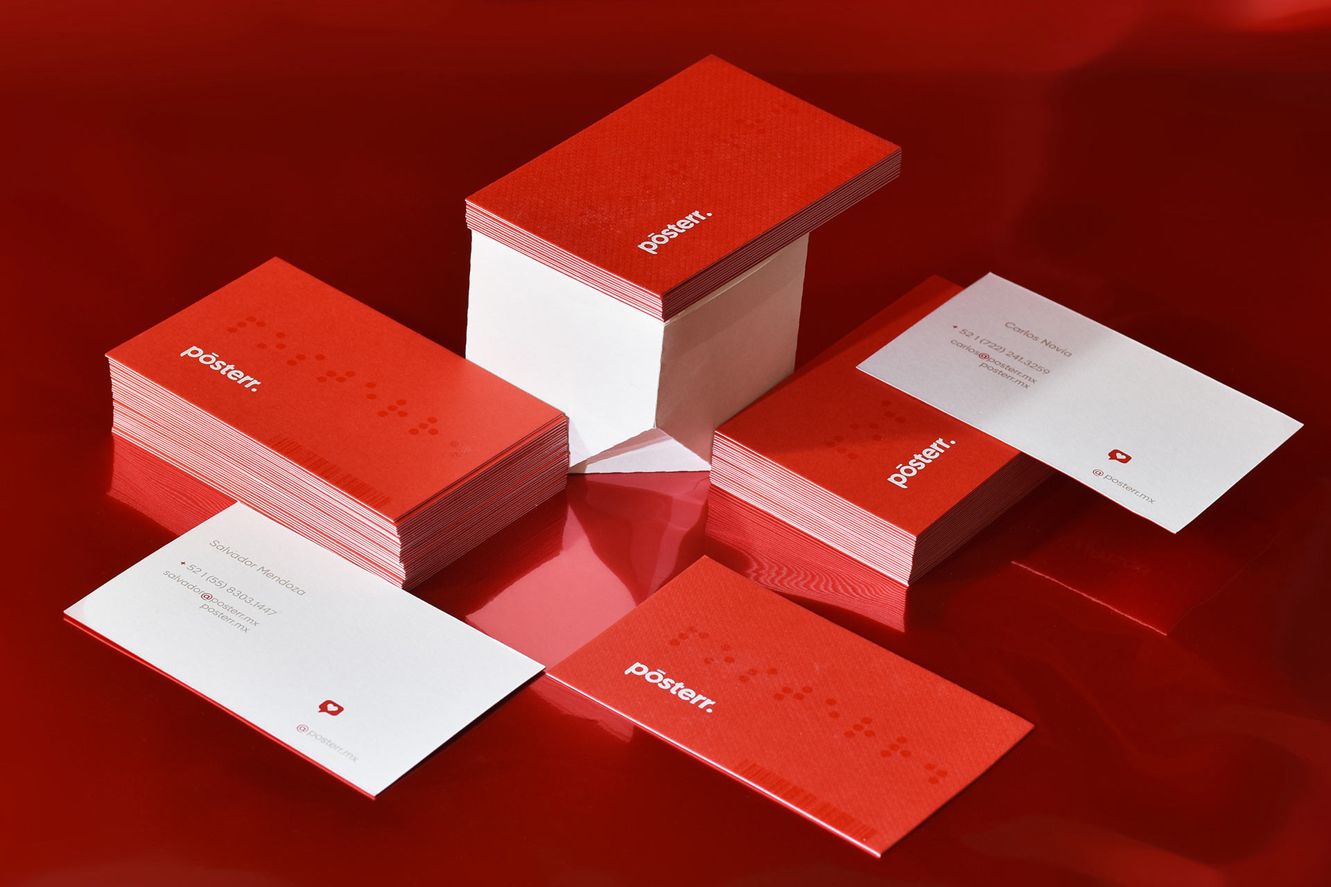
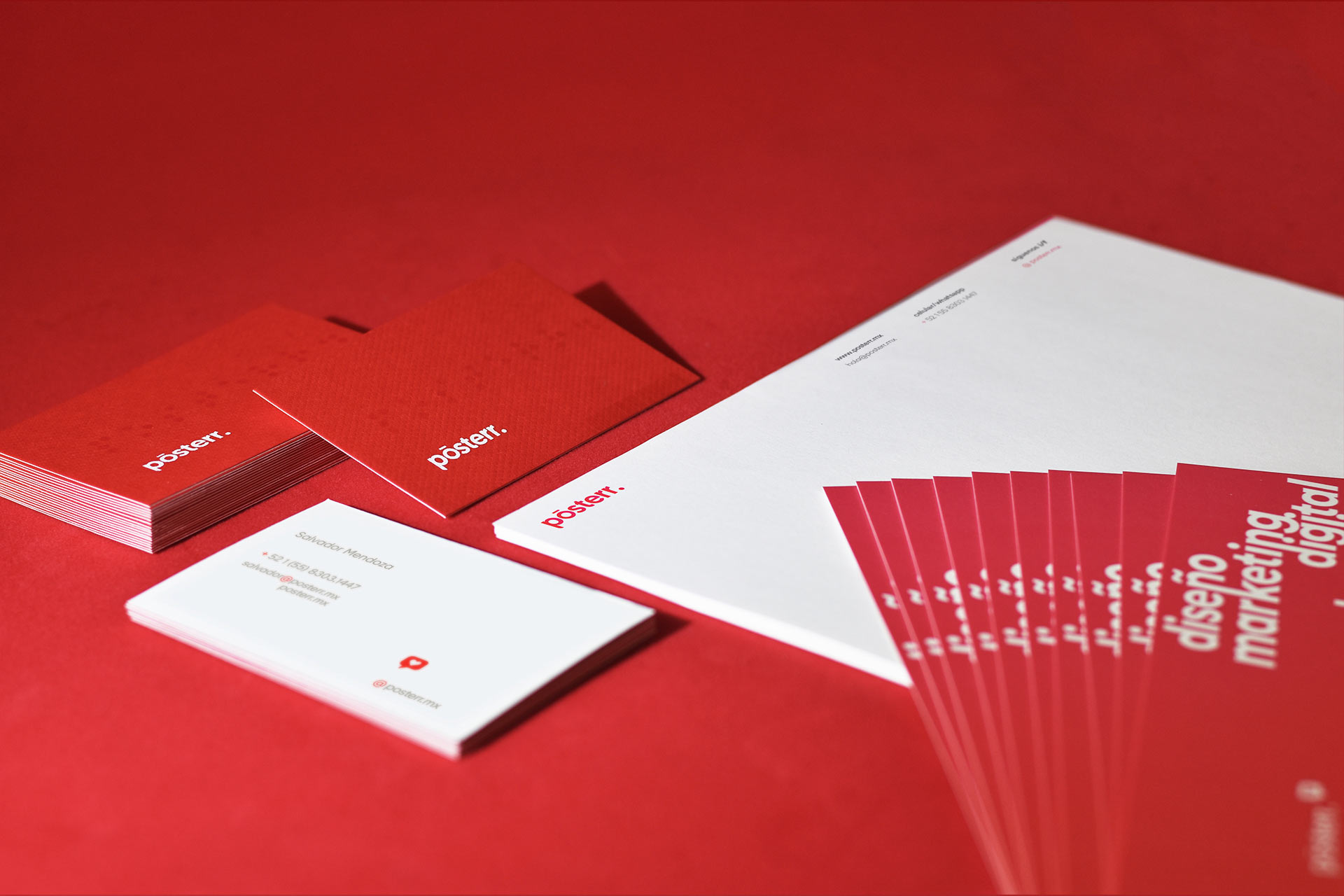
The first impression is the most important, it defines the direction of the interaction between the brand and the customer, its our presentation offering not only a quality service but having a professional, current and functional image.
 
 
The main objective when designing our business cards was to be noticed, reflecting our passion for details in the design that represent us. Everything was designed using a golden ratio based grid, combining our emblematic red color with white, captivating the eye, and then enchanting them with the diversity of print and paper textures all over the business cards.